Monday 7 May 2012

Evaluation


For my final major project I wanted to create a make-up magazine for start out professional make-up artist or for people who may just have an interest in make-up. The reason I decided to make this way because I did not feel there was much if anything on the market for people considering a career in make-up. I looked at FaceOn Magazine and Make-up Artist Magazine but I felt these were aimed at a more professional and experienced audience. I also felt these magazines were more high end and high fashion, I wanted to carry this through with FaceCake I didn’t want it to be too commercialized and young. Although it is aimed at 16 year olds but it needed to be relevant from 16 to 25 year olds therefore I didn’t want the magazine coming across to young and attract the audience I wasn’t targeted at.

I then looked through magazines to decide what I wanted to put in FaceCake. I knew I wanted to do a “How to” section. I already make “How To” videos on YouTube and they have been received well so I thought this would be a key point to the magazine. Also as I was aiming FaceCake at people who may be considering a career in make-up artistry I thought this would be a good starting point for those readers. Furthermore, Make-up Artist Magazine does occasionally have a “Hot t” section but it is aimed at a more experience audience. I decided to do two “how to” sections one 
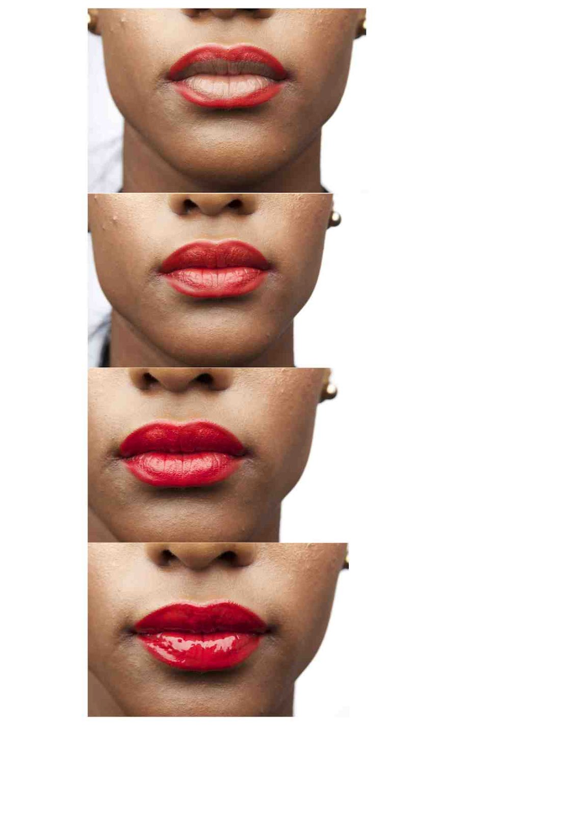
on eyebrows and the other on lips. The reason for this is because when I started out I did not know the importance of shaping eyebrows or using a lip liner. Eyebrows really frame the face and they show expression and this is important to convey the mood you are trying to get across as a make-up artist. Lips are also extremely important. It’s so easy to change the shape of lips and without lip liner the look can look unfinished and amateur.

I also wanted to conduct interviews with people in the industry, so the audience could get a better idea of what the industry and future clients will expect of them. I firstly conducted interviews with students as they are of similar ages rages and can relate well to the readers, they have also been in the same situation and some of the readers. I decided to go with a stylist and a photographer, as these are people the readers will be working with and it will give them a better idea of what to expect of the industry. I also conducted interviews with the founder of Illamasqua and Agenda beauty. The reasons behind these interviews is that Illamasqua is a well-known and well respected brand that will appeal to my readers and Agenda Beauty is a new brand so it will appeal to people who want to start their own brand or cosmetics line.

I didn’t just want the magazine to be for enjoyment but I also wanted it to teach my readers about the industry and products. So I decided to make a “behind the scenes” section. I thought this would be extremely relevant to people who may be starting or considering a career in the industry as it could give them an idea of what to expect and how to prepare. I wanted to aim this particularly at the make-up side of things rather than the photography. I started with how to set up a make-up table. As sometimes people forget how important it is to keep things clean and organized. The next step was at the photo shoot itself reminding make-up artists that it is important to jump in if something doesn’t look right. The camera will always pick it up. This can be quite daunting as a photographer can be quite intimidating; especially if it’s his or her own shoot. I wanted to assure my readers that is important to jump in otherwise you may not get hired again as the make-up artist would get blamed if it did not photograph right and this may lead to losing future jobs. The final stage is to make sure you look at the images on screen. I thought this would help my readers get the most from their work. In FaceCake I also created a must have product list. These products weren’t all make-up products, as many make-up artists do know the importance of sterilizing make-up. I wanted to inform my readers that keeping everything clean is just as important as the job they have been given.

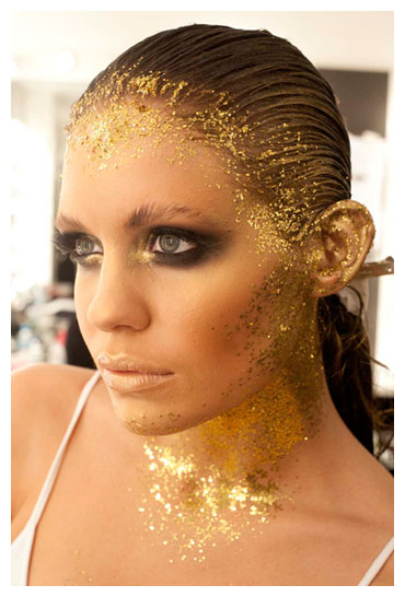
I also wanted to feature new make-up trends that will be popular in summer 2012. I found a few but decided “Heavy Metal”, “UV” and “Pastel and Hypercolour Brows”. The reason for this is because UV make-up is popular at festivals every year so I knew this trend would popular. I though Hypercolour Brows would be a great festival look as festivals are becoming increasingly popular with each passing year. I also thought metallic make-up especially in eye shadows have always been on the market and they can be great for any occasion and it’s easy for anyone to pull off.

I had some test copies printed, before it was completely finished. The reason for this was that I felt I needed to check the printing quality was good enough for FaceCake. I also wanted to check colours and fonts. I was worried that the font may have been too small and difficult for my readers to read, but after the test prints I found that this would not be an issue. One issue I did have was that some of my images came out a little yellow. Therefore I had to pull down the yellow colouring on Photoshop and I also spoke to my printers about this issue. They did suggest that this might be because of the paper so I then tested another type of paper and this was no longer an issue.

Overall, I feel that my magazine, FaceCake reached the brief I set for myself. It did teach and inform the readers and also was entertaining. It does appeal to my target market age 16 to 25; it was not too advanced but still informative and educational. If I had more time I would of liked to add more pages, however, I did create 12 images and write the whole magazine and I understand that in a real magazine their would be more than one person creating it all so I think the amount I did was acceptable. I know I could of put more thought and have a better process with choosing my photographers. I did have issues with two of my photographers when it came to getting the images. With the first photographer she would not give me many and she also said that she would not allow me to have the raw files or unedited images. I did state in an email before hand that I would need this but I needed to have it in writing. This did put me a week behind, but I did start early incase I had any issues. Although this was a problem I did learn from it and after this I had everything in writing. I made sure to create contracts for my models and photographers stating that I was allowed all the imagery and that I was allowed to use it in my portfolio, final major project, and my website. I do feel I organized myself extremely well. I started my project early to leave time if any problems or mistakes would occur. I also made sure I’d book studios as soon as they became available, as I wanted to use studios for all of my images. I also feel get a test copy of my magazine was extremely useful as it became clear what I needed to work on further and I had something to show my lectures to get advice on what needed to be done and what I needed to edit. This allowed me to go back and fix these issues without having to worry that I wouldn’t finish my work in time. Another issue I did have was I did fall behind with my learning journal. But I had all the dates, times, models and photographers in my diary so I was able to go back and look over my notes to catch up. Overall, I’m pleased and proud of my final project and do intend to put it on my website with the option to sell, I have made sure to get written permission for everyone in and involved with FaceCake. I also had an issue with the printing, one image has come out pixelated and unfortunately I did not have the time to fix this so I have printed the image and put it in the magazine, I do not understand why this problem occurred as I printed out the same file and had no issue.

Final Product

After editing the last 2 images and pages I had left i then went through the whole magazine to check for spelling mistakes, or issues that may of happened with the test copy. After finishing the last little things like adding editor's pick's to the interview the magazine was ready for printing. I'm very proud and please with the final product.

How To Do The Perfect Eyebrow Shoot 25th Mar

I wanted this to go along side my "How To Do The Perfect Lip" section. It would be done and shot in the same way. I decided to show how the eyebrow should be shaped.

I again used Hannah Newman as the photographer. I used my friend and model Jade Leech. She has modeled for me a few times before and she's a close friend so I knew we'd work well together.

Here's the final page.


Behind The Scenes 24th Mar

I thought it was really important to do a behind the scenes section in FaceCake. I thought this would appeal to my target audience as I am aiming FaceCake who may be considering or starting a career in make-up they may not have experienced a professional photoshoot before so I thought this would be extremely useful to them. Also I thought this would appeal to people who have an interest in make-up and the fashion industry as they can see what goes on behind closed doors.

I knew I wanted this image to be really strong and powerful. The reason for this was that I had put a lot of nice and pretty imagery in the magazine I wanted some of the images to be a bit more edgy and as there is a lot of text to go along side this image I thought it would make people stop and pay attention to this.

My photographer was Hannah Newman. She did a lot of the photography in FaceCake as we really clicked well and she was great to work with. She takes direction well, always comes prepared and has loads of ideas.

I did the shoot in steps. The first photograph was of the make-up table, the second was of me touching up the make-up on the shoot and the third was looking at the images on the computer. The final Image is featured on the next page.


Sunday 6 May 2012

Test Copy

I still hadn't finished the magazine but while I was home for easter I felt it was important to get a text copy of FaceCake to check colours, images, fonts, text and paper.This way I would know what to expect when my final copy was ready to print. I put the whole magazine on InDesign in order so I could see the layout and how much more I needed to do. I only had 4 blank pages left.

When the test copy came back I took it in to Uni to discuss with my lectures. A few things needed editing. We decided that some of the sections in the magazine needed introductions. So I went back and added them. One issue I did have was that some of my images came out a little yellow. Therefore I had to pull down the yellow colouring on Photoshop and I also spoke to my printers about this issue. They did suggest that this might be because of the paper so I then tested another type of paper and this was no longer an issue. Another issue I had was that some of the pages that were meant to be white came out a little grey. I discussed this with my printers and they fixed the issue for me.

Animalistic Back Cover 18th Mar

This was my second shoot of the day. I already had had complication with the photographer that morning so I decided to go home and come back before the shoot to give him some space hoping this would make things better. It did for a little while except half way through the shoot he started shouting and swearing for no reason. I tried to ignore it and just try to make my model comfortable. After his outburst the shoot went fine.

I decided to go for a lot of contouring and a lot of gold and bronzes. The reason for the colours as they are warm colours and as the magazine would be released the summer time I though this would tie in with the season well. I wanted it to contrast with the cover image. The cover image is soft, and pretty and I wanted this image to be really strong and powerful as it's the last thing the reader will see. Like the cover when you turn the page the back of the head matches up.

I felt this shoot went well and I loved the model's look, but she was not great at posing and I felt I had to put her into a pose and is was quite hard work.

After the model had gone home i decided I needed to talk to the photographer about his behaviour on the shoots. I explained that if it was work he was being paid for he would never of been like that and not only did he make me uncomfortable but my models also and this was unacceptable. He did not want to listen so I dropped it but he started screaming and swearing in my face so I decided to quit my job then. I have still credited him in the magazine but unfortunately I will not work with him again.

I then edited the image and turned it into a magazine cover.
However, when showing my lectures they felt a little confused by the two covers and suggested I removed the text. So this is the final image, and the back.


About The Issue Shoot 18th Mar

This shoot was just an image to go along side the text about the issue. I had wanted to work with the model for a while and I've seen a lot of her work and beauty shoots seem to be more her thing so I thought she'd be great for this. I wanted to go with pastels and sugar colours to really clash and contrast with her dark skin tone. I felt the colours really looked great on her.

I did the shoot at Photo Shoot Studio again and I had worked with the photographer many times so I didn't think this would be an issue. However, on this shoot he was really unprofessional and did not listen to me or take my direction at all. Because of this I didn't have as many images to chose from as he was more interested in doing his own thing. Also i felt he was inappropriate as he was asking out the model and I felt this was extremely unprofessional, so I had to pull him aside and talk to him. This didn't go well I explained that I'm more than happy for him to take his own shots for his portfolio but I was concerned that I wasn't getting the imagery I wanted or needed. I then said to him that I didn't feel it was a good time to be asking out the model and he kept talking to her the whole time I was doing and touching up the make-up so I had to ask him to stop as I could not do a lip line while she was talking. He apologized and seemed to agree with me but he was then angry with me for the rest of the day.

After that the shoot was rather uncomfortable and awkward so, I looked through the images and found a few I liked and decided to finish the shoot early.

Here's the final shoot.


UV Trend Shoot 15th Mar

This shoot had lots of testing before hand so I was quite confident when it came to doing the shoot. I had chosen a model that was quite experienced as I thought this would be a difficult shoot and look to pull of. I also chose the model because she had good skin and blemishes where more obvious with the UV lights than what they would be with normal lighting.

I had decided to do it at Photo Shoot Studio where I worked as I would be able to change the light blubs to UV one's easily and I felt I may need a more experienced photographer than the students I had be using. Also i had the option to use the studio all day so i wouldn't have been kicked out like at uni and worrying that i didn't have the shot.

The main issue I had with this shoot was that the shutter speed had to be so slow because there wasn't much light. The UV lights don't give out much light so when the shutter speed was high the pictures were almost completely black. How the model was good at sitting extremely still so we did get some that were in focus.
This is my final shot edited.
I then had to shoot the UV make-up products to go on the next page as this was one of my trends/ However, i couldn't do this at the studio as they don't have a light table so I shot it at uni. Here's the final image.

Wednesday 2 May 2012

Agenda Beaut Shoot 13th Mar

I while ago I was contacted by Agenda beauty. They are a new make-up brand releasing in April this year. They asked me if I wanted to be a product reviewer and be an artist representative. They sent me some products in the post and I asked them to do an interview for me as I thought it would be useful for people who want to start their own make-up brand. They only send me a blush and a eye shadow in the post which they wanted me to create a whole look from using pretty much just their products. I really wanted to tie this in with my magazine so I had to think of new ways to use the products. I tried mixing the colours with water and Vaseline to see what would work best. Mixing the green eyeshadow with water worked so well, it turned into a paste like texture and it really brought out the pigments and the glittery shine it had.

I decided to do this shoot in steps as I didn't want to go all in and not like the image. Jennifer gave me this idea in a meeting about our progress that morning. I decided to use Illamasqua skin base foundation as i wanted the skin to be flawless. Then used the blush and and eye shadow normally to start with. I also used eyebrow cake from Illamasqua, I thought that this may look best for my work and I could always send another to agenda beauty. I liked this image however, it didn't feel very me. I felt it was too simple and against the rest of the imagery in the magazine this image wouldn't compare with standard and would not make my readers stop to look at the image which isn't the point. I then mixed the eyeshadow with water and used it to create a lip line. I kept the lip colour nude as i wanted the green to be the focal point of the image. I decided to go with an angle lip with a pointed cupids bow as I wanted to contrast with the soft, blended green on the eyes. This I felt made the imagery much stronger but I still wanted to push it further so after a few frames of this I changed the brows. I then used the green eyeshadow the same way I would use eyebrow cake. I loved the contrast between the harsh brows and lips with the soft eyeshadow and this became my final image.

I had worked with this photographer previously and we really got on well, she takes direction well and has loads of ideas and really prepared well for the shoots she had done before so I knew she would be happy to do this. Agenda beauty loved the imaged and I will be the artist representative for April 2012 and I will be the first one and will open the brand.

Monday 12 March 2012

How to do the perfect lip shoot 5th Mar

My idea behind this shoot was to show how to do the perfect lip. I wanted to do this in 4 stages.
Lip liner,
Fill the lip with lip liner,
Lipstick, then
lipgloss.
The final image will be the right page of the spread and fill the whole page. While the others are set out in the same way as my behind the scenes segment, with the text and the image next to it then below there will be the next image and then the text and then below the third image and text. The text will explain what to do.
These are the four unedited images.

I then did the write up of this section in the magazine and edited the images this is the final page.
 
I did the photographer in a lesson with Jason Klass, this really helped as the images went straight up on screen and I could see if there were any brush strokes or if the lipstick had bled. I also had him there to help with the set up and the lighting as i find this the most difficult part. I did not get on with my model however. She was an hour and a half late even though i rang her the night before and that morning to remind her.  She was also uncooperative and made the shoot had than it had to be. I had asked her a week before to exfoliate her lips a few days before which she did do which made the images look a lot better. She also did not look like the images I had seen of her on model mayhem, so I will not be working with her again. But I am extremely happy with the final images.

Illamasqua Shoot 12th Mar

I did this shoot with mainly Illamasqua products. This image is going to feature next to the interview with Julian Kynaston. The shoot went really well, except the photographer was running late and didn't think to tell me until I asked her where she was. I found the model on model mayhem, in her profile pic she had really strong, edgy make-up so I knew she could handle a lot of make-up. I wanted to go with a cat-shaped eye. I went with a purple and navy/black smokey eye, pink/purple lips with a black liner and contouring. The reason for this was because the look would be quite dramatic, and dark and this is how I see Illamasqua. Also I wanted the image to be really strong and powerful. I'm currently editing the images, the eyeliner need some work as it isn't perfectly straight. This is the edited image so far.

I love the contrast of the model's pale skin and the dark make-up and the clash with the make-up and her red hair really makes the make-up pop. I used a lot of the techniques I was taught at the school of make-up art. It still needs further editing but I really happy with the overall image. I am considering to crop the image but I want to finish editing it first and see how it looks once printed. I wanted this image to be really close up so it really displays the strong make-up.

After speaking to Brent, he showed me a better way to edit the eyeliner flick than using the spot healing brush, I used the clone tool and it looked much better.


Pastel Cover Re-shoot 8th Mar

After the complications I had with the previous photographer I had to re-shoot the pastel cover. This was meant to be the front cover however, after editing the sunset cover re-shoot on the friday this image was stronger and looked more like a cover.
This is the edited version so far. However I want to change the background to white. It was shot against a white backdrop but because the pastel make-up was so light it didn't show up as well when making the light brighter. I also need to edit the hair but i'm not 100% sure how to do this so i'm going to take it to Jason or Brent and see if they can help me. However I'm not sure this image is strong enough to be a cover. I do have other options but I can't get the back of the head to match up, so I may use this as my pastel trend rather than the cover and come up with a different concept for the other cover.
I did find a back image to match up with the front. This is it edited so far, it still needs work on the wispy hairs but when trying to edit this with the spot healing tool it went blurry so I need to get further help.

Sunday 11 March 2012

Contents Page

After deciding on a font i thought I'd start with the contents page. I messed around with different sizes and came with this: 
Font: Book Antiqua.
Heading size: 30
Subheading size: 14
Main Body Text size: 10

I will use this throughout the magazine the only exception will be the cover where i will still use the same font just different sizes.

Make-up Product Pages for Trends


Sunset Cover Reshoot 5th Mar

 The sunset cover reshoot went really well. I used the same model as before as I knew she suited the make-up. I was really happy with the final look. However, I really struggled with the hair as I wasn't used to work with someone with such thick hair and just couldn't get it right, so I asked Steph to help me. As I was also photographing the back of the head this was a big issue.
These are the unedited and edited images.


This is the cover.
 As you can see I slightly changed the look. I made the eyeshadow go up to brow and I got rid of the bottom lashes. The reason i chose this image is because it's very strong. The model draws you in with her eyes, and this screams summer to me.
The only problem is the back doesn't match up 100% i need to make the shoulder on the front wider so they go to the edge of the page so it can match up with the back, I'm not sure how this will look so i'm going to ask Jason what he thinks is the best way to edit it.

Interview with Photographer Jennifer Frazer and Stylist Sophie Hawks


What do you expect when you come to a photo-shoot?

Jennifer Frazer: I expect punctuality, and good moods. I prefer to have an open and clean space ready to be used

Sophie Hawks: As a stylist, I'm quite organised, I like to know in advance exactly what outfits are being put together with what accessories and footwear. Therefore I like a photo shoot to be relaxed but organised. I hate chaotic situations and therefore plan ahead, put some music on and enjoy the photo shoot!


What do you expect from the Make-up Artist?

Jennifer Frazer: I expect them to work at a good pace. I expect no foundation lines and baby hairs to be invisible, I expect there attention throughout the shoot to ensure the standard is maintained.

Sophie Hawks:
I expect Make up artists to suggest their own ideas, if I were to give a brief outline of what I want the look to be like, I love it when a make up artists sees my vision and interprets it in his/her way.

What do you think is an important must have for a make-up artist?

Jennifer Frazer: clips and grips. It's so important and useful for every shoot and all aspects

Sophie Hawks: I think a signature style is good for a make up artists, similar to that of photographers, that you can see an image and know who has worked on it.

What’s a good quality for a make-up artist to have?

Jennifer Frazer: friendly! They are the first contact with the model, and the model needs to feel comfortable and in a good mood ready for the shoot.

Sophie Hawks: Friendly and chatty. I think the make up and hair process gives the model a chance to prepare for the shoot and chill out.


Credits


Shoot Model Photographer
Adgenda Beauty Jess Leavins Hannah Newman
Illamasqua Laura Jane Brockbank Zoe Rollings
Animal Cover Charlotte Collins Tristan Casey
Pastel Trend Charlene Vincent Jennifer Frazer
UV Trend Gemma Cunningham Tristan Casey
Heavy Metal Trend Emily Murphy Sophie Hannah Richardson
Sunset Cover Elesha Eden Hannah Newman
Lip Zara Marie Cumberbatch Charlotte Carrington
Eyebrow Jade Leech Hannah Newman
Behind The Scenes Charlotte Drain Hannah Newman
About The Issue Sarah Salim Tristan Casey
Ice Age Rosanna Kate Derrick Jennifer Frazer
Assistant  Stylist Make-up Artist
Jasmine Day
Charlotte Carrington


Charlotte Carrington
Sophie Hannah Richardson Charlotte Carrington

Sophie Hawks Charlotte Carrington
Sermila Harris
Charlotte Carrington
Analise Trotter
Charlotte Carrington


Charlotte Carrington


Charlotte Carrington


Charlotte Carrington


Charlotte Carrington


Charlotte Carrington

Sophie Hawks Charlotte Carrington
Hair Stylist Date
Charlotte Carrington 13th Mar
Charlotte Carrington 12th Mar
Charlotte Carrington 18th Mar
Charlotte Carrington 2nd Feb
Charlotte Carrington 15th Mar

1st Mar
Stephanie Bennet 9th Mar
Charlotte Carrington 5th Mar
Charlotte Carrington 25th April
Charlotte Carrington 24th April
Charlotte Carrington 18th Mar
Charlotte Carrington Nov


Saturday 10 March 2012

Brushes Double Page Spread

In the magazine I decided to do a double page spread on make-up brushes. I wanted to label them and state their uses.
I had seen this in Make-up is Art by Jana Ririnui and Lan Nguyen, and I really liked the idea.

I decided to lay the brushes out scattered and I didn't want it to look too neat. I then edited the photos and and labeled all the brushes.
This was my first try. After review with my lecturers  they made me realise I need to think about the text more. The text was overpowering the image and taking the attention away from the brushes. It was to bold and too big. So I thought do the title in black and the description in gray. So I tested different fonts that I liked.
I then re-wrote the brush pages.

But after printing them out the text was too small and the gray text was too light. As I still was 100% sure on the text I had chosen for these copies the text was Book Antiqua. I do like it but I also like Georgia. I thought the next best step would be to start on the contents as this page would be just text and I could look at it a lot better.

I finally found a size that worked.


Wednesday 7 March 2012

Face Charts

Eyebrow Shoot


 Illamasqua Shoot
 Lip Shoot
 Agenda Beauty Shoot
 Pastel Cover Shoot
Sunset Cover Shoot


UV Trend Shoot
Pastel Trend Shoot

Shoot Timeline

Thurs 2nd Feb - Pastel Trend Shoot
Mon 20th Feb - Pastel Cover Shoot
Thurs 23rd - Pastel Trend Reshoot
Fri 24th Feb - Sunset Cover Shoot
Thurs 1st Mar - Heavy Metal Trend Shoot
Mon 5th Mar - Lip Shoot
Thurs 8th Mar - Pastel Cover Reshoot
Fri 9th Mar - Sunset Cover Reshoot
Mon 12th Mar - Illamasqua Shoot
Tues 13th Mar - Agenda Beauty Shoot
Thurs 15th Mar - UV Trend Shoot

Monday 5 March 2012

Heavy Metal Trend Shoot 1st Mar

The next trend to shoot was the heavy metal trend. I found this trend on Vogue.com. I researched into gold leaf and decided that's what I wanted to use in my shoot. I brought Leaf metal that came in silver, bronze and gold, however, unlike normal leaf metal it came in flakes not in sheets.

I was inspired by these two images. I really likes the idea of focusing round the hair line. I practised applying gold leaf to the face and hair that day in the make-up room until i was happy with the look. I decided to keep the make-up sultry and smokey. I used a lot of bronzers and shimmers and created a smokey eye with bronze colours and browns. I also decided to keep the model's hair out of the image and just have focus on the face and hair line. I also wanted to use the hands in the image so painted the models nails gold to go with the rest of the look. This is my final image.


I decided to go for an image where the model was facing forward. This images is really eye catching and you connect with the model as it looks as if the model's looking directly at uni. I think this image will work well in a magazine because the readers will stop and look at it rather than just flick through. Although this isn't a look someone would wear you can take parts of it like the eye make-up or the colours etc, and as i've photographed the products and put them on the page next to this the reader can see how they could change the work and still work from the same colour palette.
this is the unedited image, it needs editing obviously. The colour balance needs to be changed and there are spots of eyeshadow where it has dropped onto the cheek bones.

At first I over edited the image and it looked blurry and messy. So I started again. This is the next edited version.

I wanted this image to be soft but still edgy. I love that the model is looking directly at the reader, it really draws the readers in and it creates a connection with the model and the reader. I wanted the hands in this image as i wanted it to be a close up beauty image. It still needs further editing as there's a spot on the models head that looks like a dirt patch this is caused by the fools gold eyeshadow dust I used. This is the final edited:
I also shot the product page. This will feature next to this image to show readers how to get the look.

UV Trend testing 29th Feb

 I found the UV trend on WGSN.com. I was really inspired by these 2 images.


I work at Photo Shoot Studio, so I thought this would be the best place to do it as I can change the light bulbs to UV ones and I can use the studio for as long as I need. I used UV aquacolours and put them under the UV lights to see how they came out. The only problem i had was that the orange and pink look almost the same. I then flicked paint into my hair to see how it would look on camera. After looking at the images it was clear that the paint through the hair was hardly noticeable so i decided to add more paint. The more paint i added the better it looked. I would need help on this shoot as ii have to shoot the model in a black box to make the make-up really stand out and I need to use reflectors to highlight the models face otherwise you'd just see the make-up not the model. I have arranged this shoot for the 15th of March and I'm asking the first from whose buddy up contract I received.
These are images from the test shoot.


 This shoot was about testing the makeup and the light. I brought 2 UV bulbs and as you can see it wasn't strong enough lighting to show the UV make-up so I then borrowed a backlight to make the image more blue like my inspirations. I had some real difficulty with the make-up. At first the pink aquacolour i used on my lips (in the first images) came out orange. So i had to try UV lipsticks which came out patchy so i've brought a UV lip pencil from stargazer and this should hopefully help as i'll be able to coat the lips with pencil first and then apply lipstick. I also had problems with my UV mascaras. In the last image you can see the purple mascara came out well under the UV lights and the green mascara wasn't has clear so i covered them in the green UV aquacolour colour on top of the mascara and this came out better. The orange aquacolour worked really well and was really strong. The blue UV eyeliner I used did not show up at all and as I want the skin to come out blue in the picture I will have to use another colour. This was just rough make-up just to see what colours and products showed up, that's why the circles are not perfect.