Monday, 12 March 2012

How to do the perfect lip shoot 5th Mar

My idea behind this shoot was to show how to do the perfect lip. I wanted to do this in 4 stages.
Lip liner,
Fill the lip with lip liner,
Lipstick, then
lipgloss.
The final image will be the right page of the spread and fill the whole page. While the others are set out in the same way as my behind the scenes segment, with the text and the image next to it then below there will be the next image and then the text and then below the third image and text. The text will explain what to do.
These are the four unedited images.

I then did the write up of this section in the magazine and edited the images this is the final page.
 
I did the photographer in a lesson with Jason Klass, this really helped as the images went straight up on screen and I could see if there were any brush strokes or if the lipstick had bled. I also had him there to help with the set up and the lighting as i find this the most difficult part. I did not get on with my model however. She was an hour and a half late even though i rang her the night before and that morning to remind her.  She was also uncooperative and made the shoot had than it had to be. I had asked her a week before to exfoliate her lips a few days before which she did do which made the images look a lot better. She also did not look like the images I had seen of her on model mayhem, so I will not be working with her again. But I am extremely happy with the final images.

Illamasqua Shoot 12th Mar

I did this shoot with mainly Illamasqua products. This image is going to feature next to the interview with Julian Kynaston. The shoot went really well, except the photographer was running late and didn't think to tell me until I asked her where she was. I found the model on model mayhem, in her profile pic she had really strong, edgy make-up so I knew she could handle a lot of make-up. I wanted to go with a cat-shaped eye. I went with a purple and navy/black smokey eye, pink/purple lips with a black liner and contouring. The reason for this was because the look would be quite dramatic, and dark and this is how I see Illamasqua. Also I wanted the image to be really strong and powerful. I'm currently editing the images, the eyeliner need some work as it isn't perfectly straight. This is the edited image so far.

I love the contrast of the model's pale skin and the dark make-up and the clash with the make-up and her red hair really makes the make-up pop. I used a lot of the techniques I was taught at the school of make-up art. It still needs further editing but I really happy with the overall image. I am considering to crop the image but I want to finish editing it first and see how it looks once printed. I wanted this image to be really close up so it really displays the strong make-up.

After speaking to Brent, he showed me a better way to edit the eyeliner flick than using the spot healing brush, I used the clone tool and it looked much better.


Pastel Cover Re-shoot 8th Mar

After the complications I had with the previous photographer I had to re-shoot the pastel cover. This was meant to be the front cover however, after editing the sunset cover re-shoot on the friday this image was stronger and looked more like a cover.
This is the edited version so far. However I want to change the background to white. It was shot against a white backdrop but because the pastel make-up was so light it didn't show up as well when making the light brighter. I also need to edit the hair but i'm not 100% sure how to do this so i'm going to take it to Jason or Brent and see if they can help me. However I'm not sure this image is strong enough to be a cover. I do have other options but I can't get the back of the head to match up, so I may use this as my pastel trend rather than the cover and come up with a different concept for the other cover.
I did find a back image to match up with the front. This is it edited so far, it still needs work on the wispy hairs but when trying to edit this with the spot healing tool it went blurry so I need to get further help.

Sunday, 11 March 2012

Contents Page

After deciding on a font i thought I'd start with the contents page. I messed around with different sizes and came with this: 
Font: Book Antiqua.
Heading size: 30
Subheading size: 14
Main Body Text size: 10

I will use this throughout the magazine the only exception will be the cover where i will still use the same font just different sizes.

Make-up Product Pages for Trends


Sunset Cover Reshoot 5th Mar

 The sunset cover reshoot went really well. I used the same model as before as I knew she suited the make-up. I was really happy with the final look. However, I really struggled with the hair as I wasn't used to work with someone with such thick hair and just couldn't get it right, so I asked Steph to help me. As I was also photographing the back of the head this was a big issue.
These are the unedited and edited images.


This is the cover.
 As you can see I slightly changed the look. I made the eyeshadow go up to brow and I got rid of the bottom lashes. The reason i chose this image is because it's very strong. The model draws you in with her eyes, and this screams summer to me.
The only problem is the back doesn't match up 100% i need to make the shoulder on the front wider so they go to the edge of the page so it can match up with the back, I'm not sure how this will look so i'm going to ask Jason what he thinks is the best way to edit it.

Interview with Photographer Jennifer Frazer and Stylist Sophie Hawks


What do you expect when you come to a photo-shoot?

Jennifer Frazer: I expect punctuality, and good moods. I prefer to have an open and clean space ready to be used

Sophie Hawks: As a stylist, I'm quite organised, I like to know in advance exactly what outfits are being put together with what accessories and footwear. Therefore I like a photo shoot to be relaxed but organised. I hate chaotic situations and therefore plan ahead, put some music on and enjoy the photo shoot!


What do you expect from the Make-up Artist?

Jennifer Frazer: I expect them to work at a good pace. I expect no foundation lines and baby hairs to be invisible, I expect there attention throughout the shoot to ensure the standard is maintained.

Sophie Hawks:
I expect Make up artists to suggest their own ideas, if I were to give a brief outline of what I want the look to be like, I love it when a make up artists sees my vision and interprets it in his/her way.

What do you think is an important must have for a make-up artist?

Jennifer Frazer: clips and grips. It's so important and useful for every shoot and all aspects

Sophie Hawks: I think a signature style is good for a make up artists, similar to that of photographers, that you can see an image and know who has worked on it.

What’s a good quality for a make-up artist to have?

Jennifer Frazer: friendly! They are the first contact with the model, and the model needs to feel comfortable and in a good mood ready for the shoot.

Sophie Hawks: Friendly and chatty. I think the make up and hair process gives the model a chance to prepare for the shoot and chill out.


Credits


Shoot Model Photographer
Adgenda Beauty Jess Leavins Hannah Newman
Illamasqua Laura Jane Brockbank Zoe Rollings
Animal Cover Charlotte Collins Tristan Casey
Pastel Trend Charlene Vincent Jennifer Frazer
UV Trend Gemma Cunningham Tristan Casey
Heavy Metal Trend Emily Murphy Sophie Hannah Richardson
Sunset Cover Elesha Eden Hannah Newman
Lip Zara Marie Cumberbatch Charlotte Carrington
Eyebrow Jade Leech Hannah Newman
Behind The Scenes Charlotte Drain Hannah Newman
About The Issue Sarah Salim Tristan Casey
Ice Age Rosanna Kate Derrick Jennifer Frazer
Assistant  Stylist Make-up Artist
Jasmine Day
Charlotte Carrington


Charlotte Carrington
Sophie Hannah Richardson Charlotte Carrington

Sophie Hawks Charlotte Carrington
Sermila Harris
Charlotte Carrington
Analise Trotter
Charlotte Carrington


Charlotte Carrington


Charlotte Carrington


Charlotte Carrington


Charlotte Carrington


Charlotte Carrington

Sophie Hawks Charlotte Carrington
Hair Stylist Date
Charlotte Carrington 13th Mar
Charlotte Carrington 12th Mar
Charlotte Carrington 18th Mar
Charlotte Carrington 2nd Feb
Charlotte Carrington 15th Mar

1st Mar
Stephanie Bennet 9th Mar
Charlotte Carrington 5th Mar
Charlotte Carrington 25th April
Charlotte Carrington 24th April
Charlotte Carrington 18th Mar
Charlotte Carrington Nov


Saturday, 10 March 2012

Brushes Double Page Spread

In the magazine I decided to do a double page spread on make-up brushes. I wanted to label them and state their uses.
I had seen this in Make-up is Art by Jana Ririnui and Lan Nguyen, and I really liked the idea.

I decided to lay the brushes out scattered and I didn't want it to look too neat. I then edited the photos and and labeled all the brushes.
This was my first try. After review with my lecturers  they made me realise I need to think about the text more. The text was overpowering the image and taking the attention away from the brushes. It was to bold and too big. So I thought do the title in black and the description in gray. So I tested different fonts that I liked.
I then re-wrote the brush pages.

But after printing them out the text was too small and the gray text was too light. As I still was 100% sure on the text I had chosen for these copies the text was Book Antiqua. I do like it but I also like Georgia. I thought the next best step would be to start on the contents as this page would be just text and I could look at it a lot better.

I finally found a size that worked.


Wednesday, 7 March 2012

Face Charts

Eyebrow Shoot


 Illamasqua Shoot
 Lip Shoot
 Agenda Beauty Shoot
 Pastel Cover Shoot
Sunset Cover Shoot


UV Trend Shoot
Pastel Trend Shoot

Shoot Timeline

Thurs 2nd Feb - Pastel Trend Shoot
Mon 20th Feb - Pastel Cover Shoot
Thurs 23rd - Pastel Trend Reshoot
Fri 24th Feb - Sunset Cover Shoot
Thurs 1st Mar - Heavy Metal Trend Shoot
Mon 5th Mar - Lip Shoot
Thurs 8th Mar - Pastel Cover Reshoot
Fri 9th Mar - Sunset Cover Reshoot
Mon 12th Mar - Illamasqua Shoot
Tues 13th Mar - Agenda Beauty Shoot
Thurs 15th Mar - UV Trend Shoot

Monday, 5 March 2012

Heavy Metal Trend Shoot 1st Mar

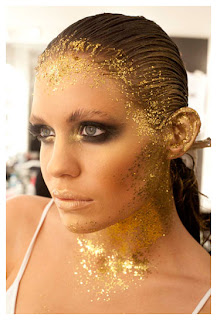
The next trend to shoot was the heavy metal trend. I found this trend on Vogue.com. I researched into gold leaf and decided that's what I wanted to use in my shoot. I brought Leaf metal that came in silver, bronze and gold, however, unlike normal leaf metal it came in flakes not in sheets.

I was inspired by these two images. I really likes the idea of focusing round the hair line. I practised applying gold leaf to the face and hair that day in the make-up room until i was happy with the look. I decided to keep the make-up sultry and smokey. I used a lot of bronzers and shimmers and created a smokey eye with bronze colours and browns. I also decided to keep the model's hair out of the image and just have focus on the face and hair line. I also wanted to use the hands in the image so painted the models nails gold to go with the rest of the look. This is my final image.


I decided to go for an image where the model was facing forward. This images is really eye catching and you connect with the model as it looks as if the model's looking directly at uni. I think this image will work well in a magazine because the readers will stop and look at it rather than just flick through. Although this isn't a look someone would wear you can take parts of it like the eye make-up or the colours etc, and as i've photographed the products and put them on the page next to this the reader can see how they could change the work and still work from the same colour palette.
this is the unedited image, it needs editing obviously. The colour balance needs to be changed and there are spots of eyeshadow where it has dropped onto the cheek bones.

At first I over edited the image and it looked blurry and messy. So I started again. This is the next edited version.

I wanted this image to be soft but still edgy. I love that the model is looking directly at the reader, it really draws the readers in and it creates a connection with the model and the reader. I wanted the hands in this image as i wanted it to be a close up beauty image. It still needs further editing as there's a spot on the models head that looks like a dirt patch this is caused by the fools gold eyeshadow dust I used. This is the final edited:
I also shot the product page. This will feature next to this image to show readers how to get the look.

UV Trend testing 29th Feb

 I found the UV trend on WGSN.com. I was really inspired by these 2 images.


I work at Photo Shoot Studio, so I thought this would be the best place to do it as I can change the light bulbs to UV ones and I can use the studio for as long as I need. I used UV aquacolours and put them under the UV lights to see how they came out. The only problem i had was that the orange and pink look almost the same. I then flicked paint into my hair to see how it would look on camera. After looking at the images it was clear that the paint through the hair was hardly noticeable so i decided to add more paint. The more paint i added the better it looked. I would need help on this shoot as ii have to shoot the model in a black box to make the make-up really stand out and I need to use reflectors to highlight the models face otherwise you'd just see the make-up not the model. I have arranged this shoot for the 15th of March and I'm asking the first from whose buddy up contract I received.
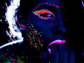
These are images from the test shoot.


 This shoot was about testing the makeup and the light. I brought 2 UV bulbs and as you can see it wasn't strong enough lighting to show the UV make-up so I then borrowed a backlight to make the image more blue like my inspirations. I had some real difficulty with the make-up. At first the pink aquacolour i used on my lips (in the first images) came out orange. So i had to try UV lipsticks which came out patchy so i've brought a UV lip pencil from stargazer and this should hopefully help as i'll be able to coat the lips with pencil first and then apply lipstick. I also had problems with my UV mascaras. In the last image you can see the purple mascara came out well under the UV lights and the green mascara wasn't has clear so i covered them in the green UV aquacolour colour on top of the mascara and this came out better. The orange aquacolour worked really well and was really strong. The blue UV eyeliner I used did not show up at all and as I want the skin to come out blue in the picture I will have to use another colour. This was just rough make-up just to see what colours and products showed up, that's why the circles are not perfect.

Cover Shoots 20th and 24th Feb

I decided to make the cover image really strong to draw people in. I loved the pastel trend and it really represents summer for me so I wanted to do another pastel shoot but change it from the other image. I decided to go more extreme with the make-up. So I decided to add more contouring and use a different coloured lip liner form the lipstick. I came up with a few different ideas on facecharts.

After deciding on my final look I practised on myself. From this image I didn't like how the colours looked together and the lips just looked washed out although this wasn't taken in a studio with a professional camera I didn't want to risk it.

So I started messing around with different colours and looks and came up with my final look.

I decide to make two covers. One for the front and one for the back page as I wanted to do another look. I was inspired by sunsets and hot summer colours like reds, golds etc.
After talking through my covers with my lectures, they came up with the idea of shooting the back of the models head so when you turn the page the images match up. I loved this idea so started researching and practising different hairstyles.

I put up a casting on model mayhem and was contacted by a photographer. She found me a model for the pastel cover and I found one for the sunset cover. The photographer misunderstood what I was using the images for, she didn't realise the magazine was going to be published, therefore I was not allowed to use the images from the pastel shoot and she had found the model through a modeling agency and the agency wouldn't allow me to use the images. The photographer wouldn't give me all of the images she only gave me a few to work with which I could not use and she would only give me edited images as she never gives out the raw images. These shoots weren't completely unsuccessful as I learnt that everything needs to be put in writing. i also will not work with this photographer again as she came across quite confrontational and we didn't click very well.


The sunset shoot looked great in the few images I was given and as the model was under 18 I had to get consent forms from her and her parents which they were happy to sign for me. The model has agreed to come back on the 9th of March and understands the complications I had with the photographer and are happy to re-shoot. I really like the over the shoulder pose but as you can see it doesn't mach up with the back of the head images so i have to re-shoot and make it clear to the photographer that they need to match up.